Statistical Analysis
The Ecosim simulation toolbox provides automatic statistical outputs to help users analyze ecological dynamics over time and space. These outputs include heatmaps and population charts, which visualize the simulation results in a scientifically interpretable format.
Heatmap Visualization
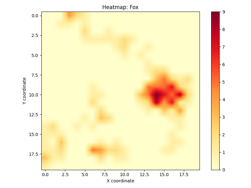
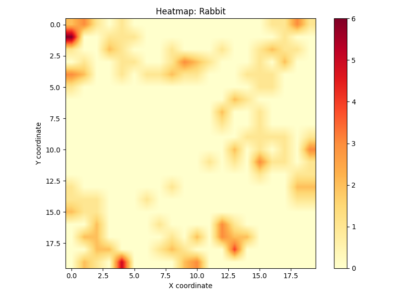
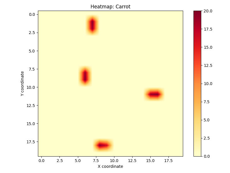
A heatmap visualizes the spatial density or activity of organisms throughout the simulation. It shows how often different regions of the map were occupied or visited by agents (e.g., predators or herbivores).
Key insights from the heatmap include:
Habitat Preference – Frequently visited areas suggest favorable habitat or resource locations.
Territory and Clustering – Certain species may exhibit territorial behavior; these clusters become visible.
Avoidance Patterns – Areas with low or no activity can indicate dangerous terrain or predator zones.
Interaction Zones – Overlapping zones of predator and prey heatmaps reveal high-risk regions.
Heatmaps are generated separately for each species and saved as PNG images in the statistics_plots/ directory.
Each pixel’s intensity corresponds to the number of visits or presence of an organism in that cell across all time steps.
Population Chart

The population chart tracks the number of living individuals for each species at every simulation step. It is one of the most important outputs for understanding long-term ecological trends.
This chart provides:
Birth/Death Patterns – Understand how fast species reproduce and die.
Predator–Prey Balance – Observe how consumer species affect each other across the food chain.
Extinction Events – Track sudden drops in population which may indicate environmental stress or hunting pressure.
Ecological Stability – Identify oscillations, plateaus, or chaos in species numbers.
The x-axis shows the simulation time steps, while the y-axis shows population size. Each species is color-coded for clarity.
Technical Notes
Both visualizations are automatically generated and saved at the end of the simulation.
The population data is tracked in memory and then plotted using Matplotlib.
Heatmaps accumulate counts per grid cell during every movement step.
All output files are stored under
statistics_plots/and are accessible for further analysis or reporting.
You can find these images in your working directory after the simulation finishes. They can also be downloaded or embedded in reports for interpretation.